 |
This article is brought by
Egor Anisimov, EPAM Senior UX Designer
Rauf Aliev, EPAM SAP hybris Solution Architect |
Introduction
Quick order forms functionality is getting to be common in B2B products. It reflects the basic need of the customers: to make a purchase quickly and efficiently. However, there is one thing that makes these forms not convenient. Commonly these forms are represented as a number of fields the customer is asked to fill out. The manual work needed to complete this exercise can be exhausting. Especially if the list is long.
Rauf and I created the PoC that demonstrates the efficient way of making bulk orders directly from the search box. In some sense we reinvent the search box. We’ve never seen this concept implemented yet.
Solution
The main idea of the solution is to simplify the process of bulk orders, especially if the list of products to order is concise and specific, such as an SKU or exact product name.
In the next example, the customer types an known SKU first, then a part of the product name. As a result, the system shows two products that match the query.

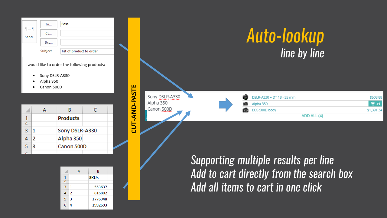
The customer is able to add a particular product to a shopping cart or all products in one click.

You may ask, what if there are a plenty of products with Alpha in the title? Which of these product the system shows in the list? The first one. For such laconic query the first result may not be the best one. To overcome this issue, there is an option to see a larger list of results for each option:
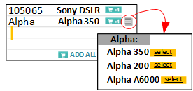
Once the customer chooses “Alpha A6000” as a right option for the query “Alpha”, all further requests “Alpha” will automatically select “Alpha A6000”.
Key concepts
Universal search box. Some implementations of quick order functionality represent a separate page or separate popup form. We decided to integrate it into the search box concept.
So we decided to use the same concept as the search box for multi-line search. Of course, internally, from the technical standpoint, these are two separate UI elements, an input box and a textarea component. However, for the user they look like different views of the same thing.
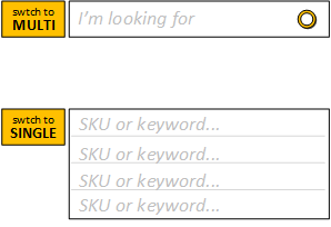
In the multi-line mode, For each line, the system resolves the entered keyword or SKU# into the product name and displays the first guess next to the query. In the PoC, the customer need to click a button “MULTI” to switch the search box into a second mode. It can also be triggered after analyzing the data copied to the regular search box. If the the data from the clipboard is a multi-line text, the search box will be displayed as multi-line. The same is when the data entered in the search box is of the particular pattern, such as an exact list of SKU, each word represents one SKU.
Each line is a query. In our solution, the each line of the multi-line search is a query, the same as used in the regular search. If the search is configured properly, the query that contains a list of SKUs will show the correct products in the result. The query with the keywords may return wrong results, but we display the suggestion next to the original query, line by line, and the customer will be able to visually check the results and amend the query if the system couldn’t find a right product.
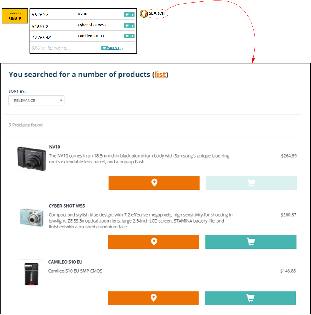
If the customer submits the multi-line request, the system will display the search result in the same look as the regular search results, but the displayed results will correspond the suggestions.
For example, if you look for three products, 553637, 816802 and 1776948, the system will display these three products in the search results.
Source code
The source code of the PoC is available here:
https://github.com/batiskafff/hyb_plugin
Video

 The customer is able to add a particular product to a shopping cart or all products in one click.
 You may ask, what if there are a plenty of products with Alpha in the title? Which of these product the system shows in the list? The first one. For such laconic query the first result may not be the best one. To overcome this issue, there is an option to see a larger list of results for each option:
 Once the customer chooses “Alpha A6000” as a right option for the query “Alpha”, all further requests “Alpha” will automatically select “Alpha A6000”.
 In the multi-line mode, For each line, the system resolves the entered keyword or SKU# into the product name and displays the first guess next to the query. In the PoC, the customer need to click a button “MULTI” to switch the search box into a second mode. It can also be triggered after analyzing the data copied to the regular search box. If the the data from the clipboard is a multi-line text, the search box will be displayed as multi-line. The same is when the data entered in the search box is of the particular pattern, such as an exact list of SKU, each word represents one SKU.
Each line is a query. In our solution, the each line of the multi-line search is a query, the same as used in the regular search. If the search is configured properly, the query that contains a list of SKUs will show the correct products in the result. The query with the keywords may return wrong results, but we display the suggestion next to the original query, line by line, and the customer will be able to visually check the results and amend the query if the system couldn’t find a right product.
 If the customer submits the multi-line request, the system will display the search result in the same look as the regular search results, but the displayed results will correspond the suggestions.
For example, if you look for three products, 553637, 816802 and 1776948, the system will display these three products in the search results.


Navigation | hybrismart | SAP hybris under the hood
21 June 2017 at 09:29
[…] (partial update, multi-line product search, static pages and products in the same list, solr 6 in 5.x, 90M personalized prices, 500K […]