Rethinking the User Interface of Tomorrow: Voice and Emotion Recognition as Auxiliary Channels
In this article, I would like to introduce my concept of a brand-new type of user interface for web, mobile, and desktop platforms. Creating something new and innovative in the web space isn’t easy. All types of interactions have already been defined and tested. However, I believe that this approach will work if things continue as they are now.
My idea involves using voice and video input as auxiliary or optional channels in user-system interactions. Systems like Siri and Alexa are built upon the dialogue concept, where the voice channel is the primary one. In my idea, the system will use voice input as a background channel while employing the traditional UI for context.
For example, if you exclaim “why?!” when something happens, the system will instantly display an icon (perhaps bouncing) in the designated area, just one click away from explanations.
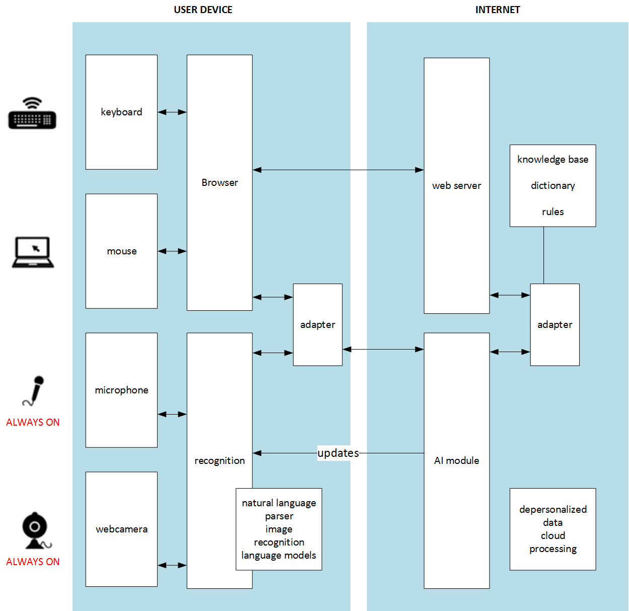
In this concept, the voice recognition component is optional. Do you remember the voice recognition elevator video? That is what happens when the voice channel is primary. If Siri or Alexa understands you on the first try, you are seen as a king in other people’s eyes. If you need to repeat yourself several times with different accents and in different ways, it becomes quite frustrating. In my idea, the voice channel will only be in play when it successfully extracts useful data from your voice. Otherwise, it ignores everything you say. There is no need to repeat yourself or wait for an action. The user relies on the primary, reliable channels: your mouse, keyboard, and display.
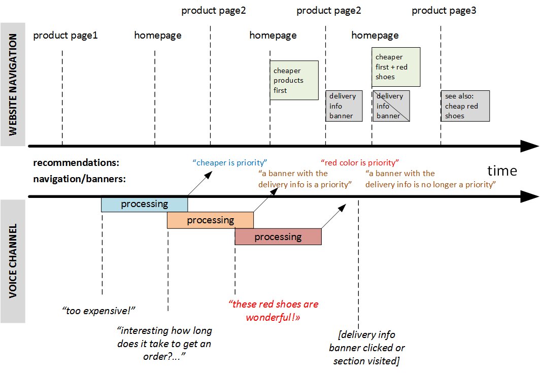
According to my idea, the system should constantly listen to your voice, continuously recognize your words, and try to improve navigation using the information received from the voice channel. If it fails (due to noise, being too quiet, or meaningless words), nothing happens. However, if it succeeds, the recommended navigation items will be closer to the user. Certainly, the system won’t place red shoes among green ones if the user explicitly sets the filter to “green”. This is a UI task: how to make this interaction smoother. For example, it could use clickable popup tooltips in a designated area.
For instance, imagine you open a shoe e-shop trying to find new shoes. You find something, open the product card, and see that the shoes are made of real leather. “Poor cows! I don’t like real leather!” you exclaim, then return to the homepage. The system then resorts/rebuilds the product carousels on the homepage and notifies you that leather shoes are hidden from the main page. In the product listings, such products are marked with a “leather” icon. You can click on “revert” if you want to undo this action. You can also navigate using phrases like “Like it” or “Don’t like it,” “Too expensive,” “I need a hat… where is it?” “Interesting, let’s come back tomorrow,” and so on. All these phrases will be interpreted and taken into account.
This concept will work with the desktop applications and mobile UI as well.
This is not rocket science. All the necessary technologies are available. This idea can be easily implemented as a working prototype for field testing.
The next logical step is to use a web-camera channel to leverage eye-tracking analysis and emotion recognition to gather information about hidden user intentions and possible preferences. Mouse tracking will also aid in this.
Certainly, nobody feels good about sending such information to internet servers for processing. The machine learning component should be closer to the user, integrated into the browser or OS. Cloud services may be leveraged for resource-intensive analysis.
What do you think?
© Rauf Aliev, June 2017
